The problem
First-class training helps teams flourish. Training – including mandatory training – plugs skill gaps, boosts performance, increases retention, creates harmony, keeps motivation and feeling valued nice and high – we could (and, okay, sometimes we do) go on.
A UK government agency came to us fully recognising the benefits of training while also recognising that their existing training wasn’t quite up to the job. They already had systems in place for important, organisation-wide training in areas including equality, diversity and inclusion and health and safety. The problem was, the content wasn’t housed together, readily available, or entirely compelling and coherent. It was also not in the newly launched internal brand house style.
The brief
Could we weave together the many strands of existing training into a visually appealing, engaging, consistent learning product, making use of a bold, recently launched new internal brand – one catering to a broad spectrum of employees?
Revamping a UK government agency’s existing training
The problem
First-class training helps teams flourish. Training – including mandatory training – plugs skill gaps, boosts performance, increases retention, creates harmony, keeps motivation and feeling valued nice and high – we could (and, okay, sometimes we do) go on.
A UK government agency came to us fully recognising the benefits of training while also recognising that their existing training wasn’t quite up to the job. They already had systems in place for important, organisation-wide training in areas including equality, diversity and inclusion and health and safety. The problem was, the content wasn’t housed together, readily available, or entirely compelling and coherent. It was also not in the newly launched internal brand house style.
The brief
Could we weave together the many strands of existing training into a visually appealing, engaging, consistent learning product, making use of a bold, recently launched new internal brand – one catering to a broad spectrum of employees?
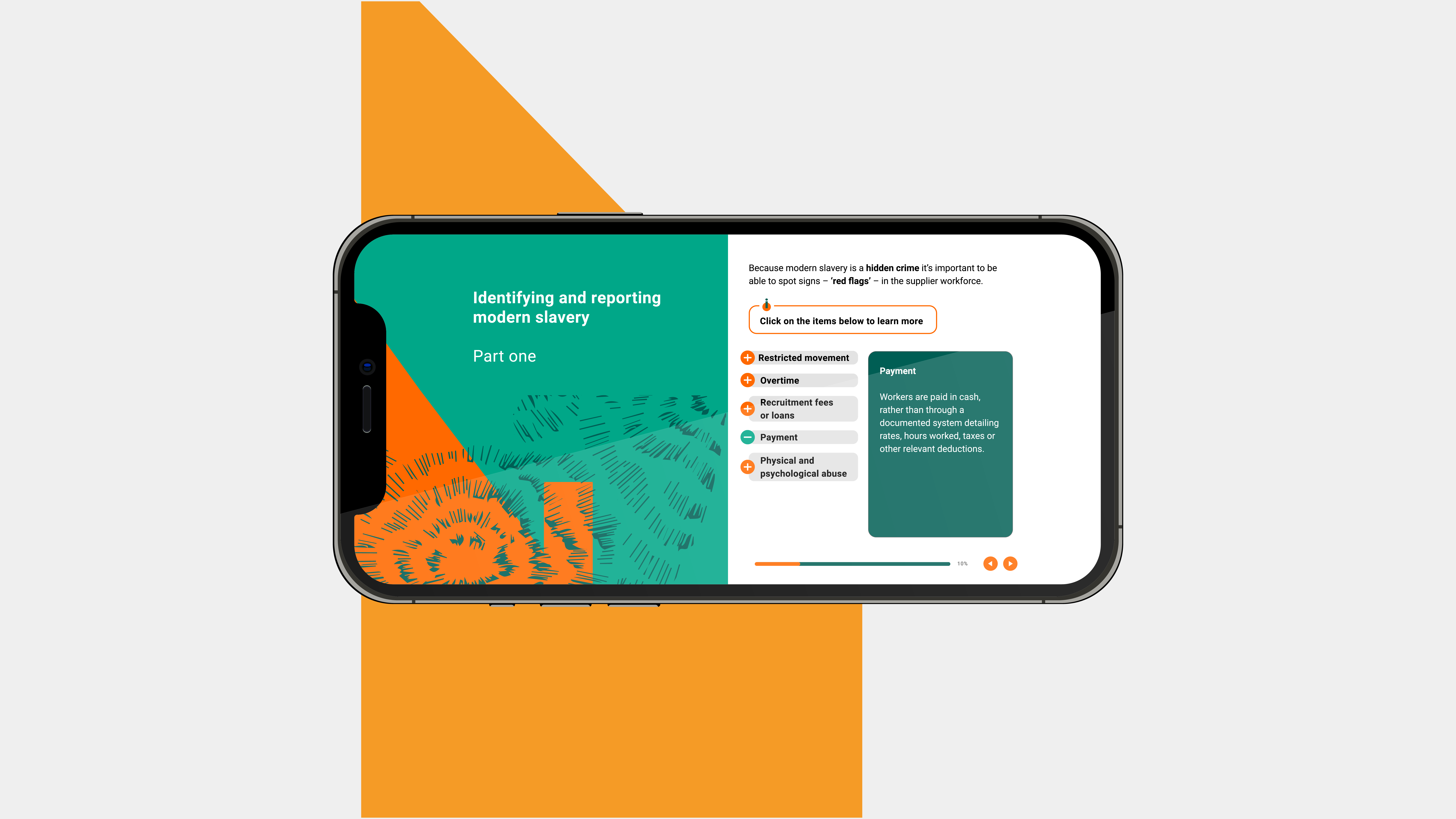
A selection of design materials we delivered
Brand led concepts // E-learning design & development // Scripts // Storyboarding // Illustrations // Animations
What we did
First up, we took a long, hard look at existing training materials and made copious notes. Pens and notebooks sufficiently worn out, we figured out what was still relevant, what needed to go where, what additional information could be added to an important learning programme and how we could present modules in a lively, illuminating fashion that would lead to lifelong learning without taking away from the serious subject matter.
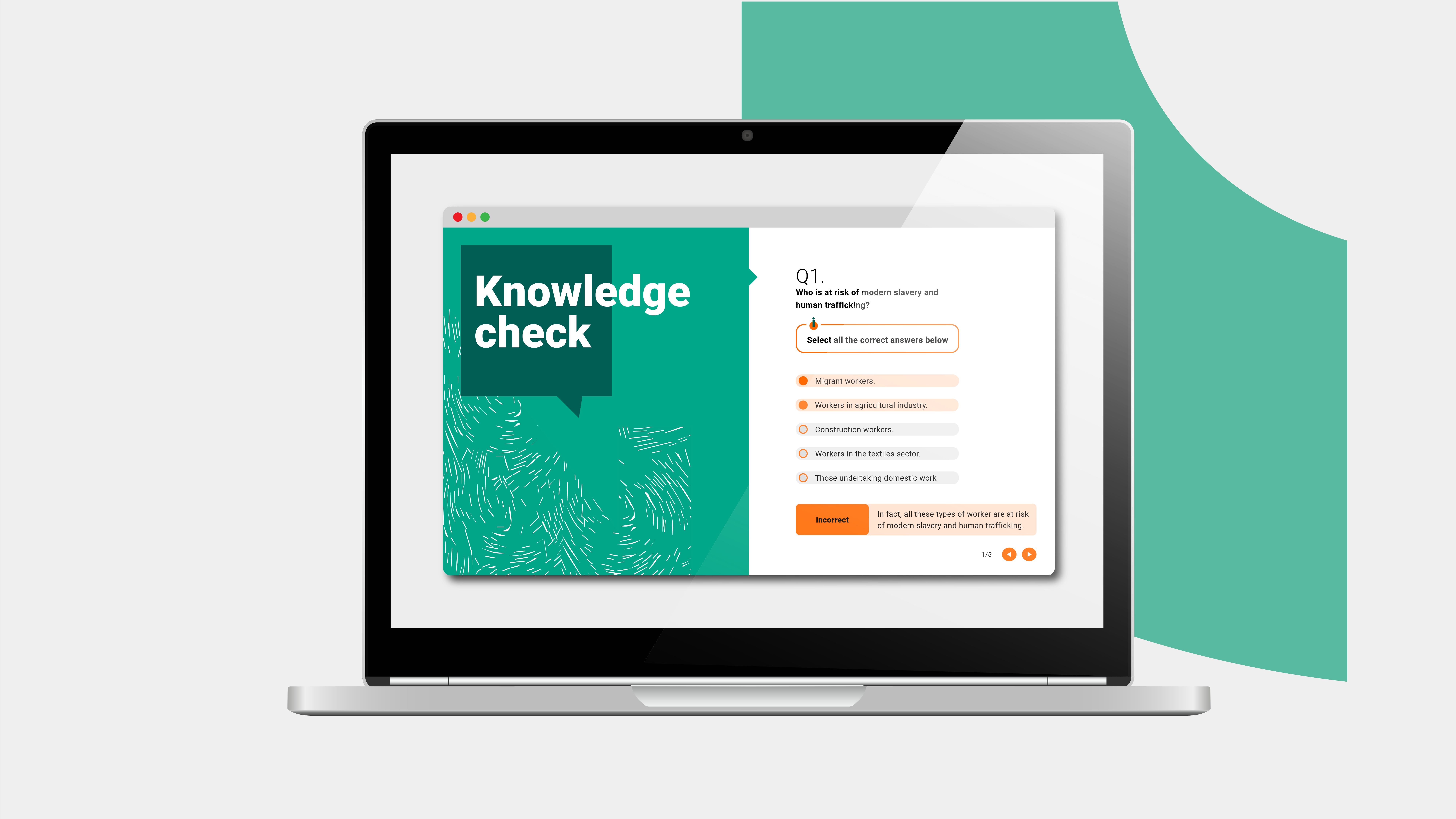
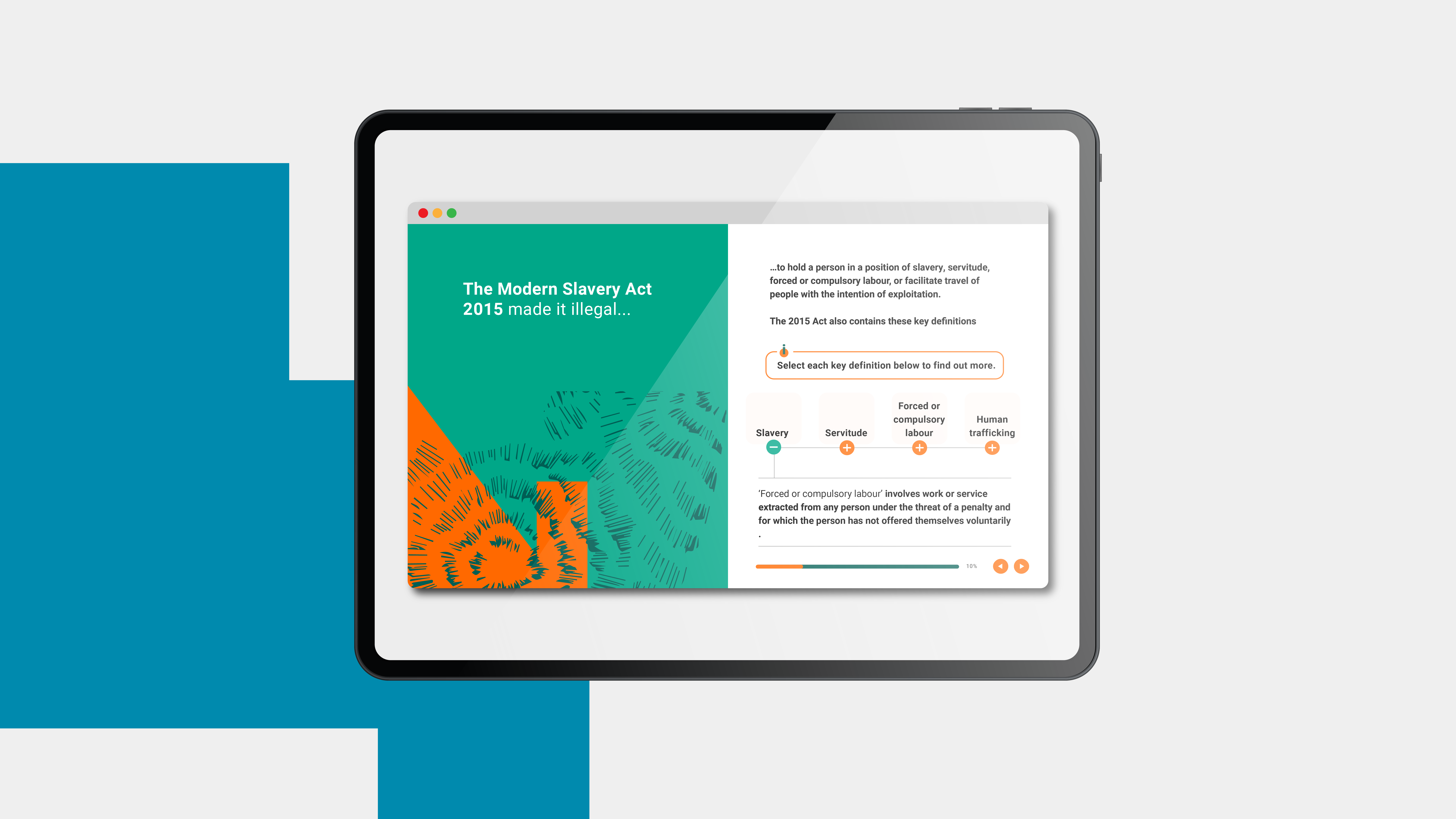
Each module within the new learner journey we created was bookended with quick quizzes, with the main body of learning upbeat and user-friendly with related animations and interactive elements.
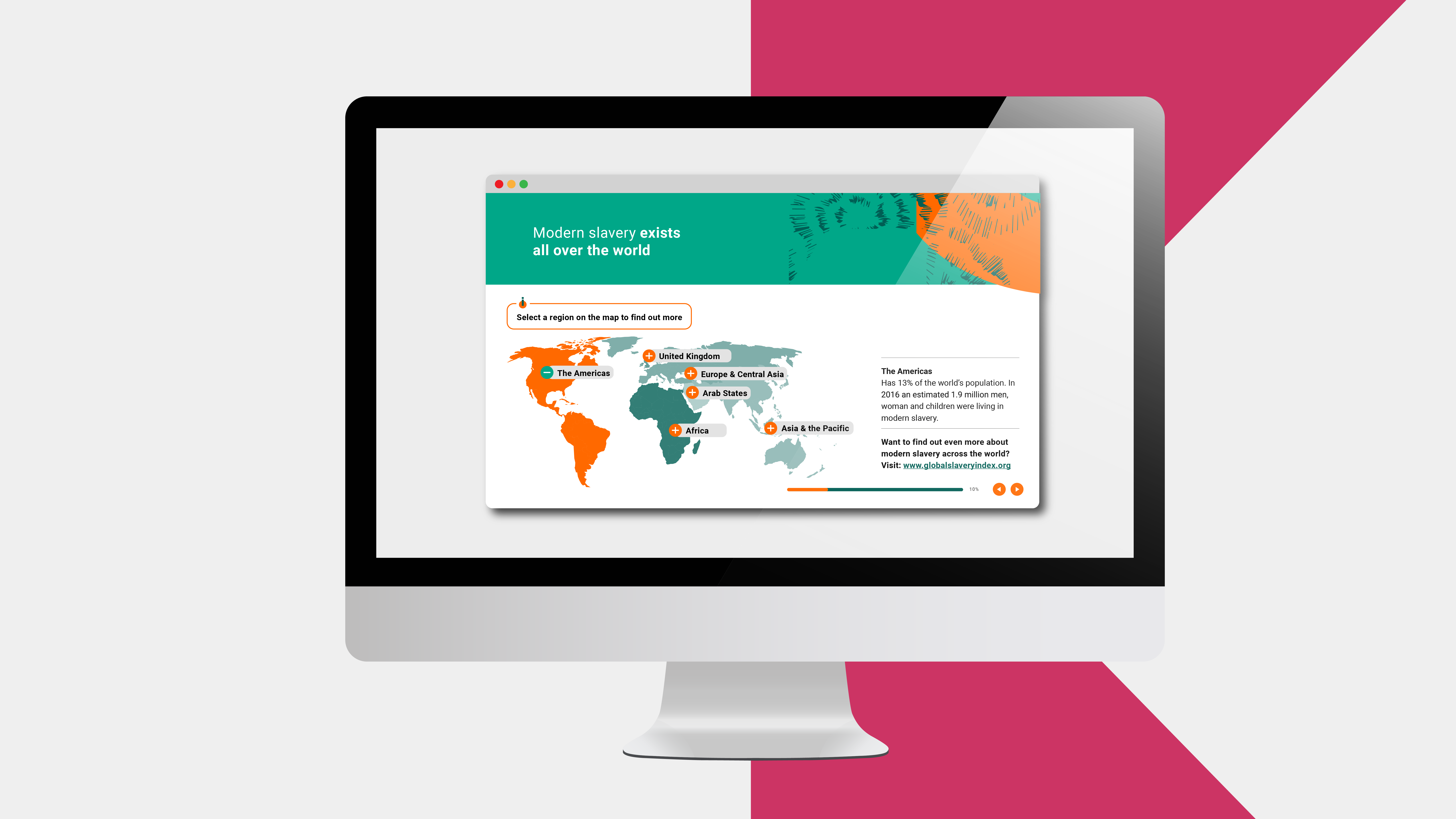
The variety of content we created – not just around the weighty, important issues of equality, diversity and inclusion but also materials on health and safety, fire precautions and how to spot modern slavery in the supply chain – was all umbrellaed under a unifying appearance and style. Instructions and content was crisp, clear and to the point but, with the scaffolding of the design supporting it, had enough personality and appeal to keep learners hooked.
Why it worked
The Behavioural Science
Zeigarnik Effect
Ever had that uncomfortable feeling of having an incomplete task hanging over you? Pretty draining, isn’t it?
Lithuanian psychology student Bluma Zeigarnik discovered (formally) in 1922 that our minds are often quick to forget about finished tasks but unfinished ones weigh us down.
Bluma is one reason we included a progress bar for each training module – giving learners up-to-the-minute info on how far they had come and offering a little extra mental motivation to keep going and complete the course.
Choice Overload
We didn’t exactly employ choice overload – rather, we recognised that too many options can often outwit and overwhelm us. Classic studies show that when we are presented with, say, just six types of jam or chocolate to choose from, we’re more likely to purchase than when we’re confronted with 24 or 30 (often bewildering) options.
We took a similar approach to the modules. Cutting down on multiple training systems with varying formats reduced the complexity of everything with employees able to focus on their required training without getting fatigued by choice.
Picture Superiority Effect
As behavioural communications devotees, we’re big believers in the power of words. But we also appreciate that pictures can speak a thousand of them.
The picture superiority effect can be defined as: pictures generally show superior recognition to their verbal labels (Nelson, Reed & Walling, 1976). Or to put it another way: pictures are mostly remembered better than words (SBC, 2022).
The graphics for this project were important in giving the training a common identity – ensuring it made a (memorable) splash.
The results
This is still live, so we’re waiting for the complete breakdown of the numbers, but the initial impact was undeniable.
This is ongoing training, currently still being rolled out and available to some 7,500 staff. So, while we haven’t received a solid set of numbers showcasing its success, we can say that projects with similarly structured training products have proved hugely successful.
Fancy being our next success story?
If you have some essential training but don’t know where to start, then do get in touch.
