
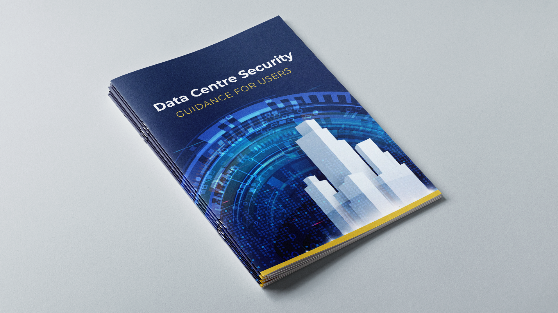
The problem
Data is one of the UK’s most valuable assets. And the centres that look after and process our data, alongside the data itself, underpin almost all facets of our day-to-day lives. This means data centres are a valuable potential target for hostile actors looking to steal information.
Because data breaches are not just the preserve of Hollywood blockbusters or schlocky TV dramas: the threat is real – and on the rise.
Our client is a UK government agency whose role is to protect national security and reduce vulnerabilities in the national infrastructure. This includes helping organisations protect themselves. For these companies, having the right guidance available to them is paramount. But there was a colossal amount of information split between different websites and so getting the right guidance was tricky. To really hit home, it needed to be more accessible, streamlined and straightforward.
The brief
Could we take all the information around data security and house it together, so that both owners and users could access everything they needed to know in order to stay safe and secure?

Deep-diving into data guidance
The problem
Data is one of the UK’s most valuable assets. And the centres that look after and process our data, alongside the data itself, underpin almost all facets of our day-to-day lives. This means data centres are a valuable potential target for hostile actors looking to steal information.
Because data breaches are not just the preserve of Hollywood blockbusters or schlocky TV dramas: the threat is real – and on the rise.
Our client is a UK government agency whose role is to protect national security and reduce vulnerabilities in the national infrastructure. This includes helping organisations protect themselves. For these companies, having the right guidance available to them is paramount. But there was a colossal amount of information split between different websites and so getting the right guidance was tricky. To really hit home, it needed to be more accessible, streamlined and straightforward.
The brief
Could we take all the information around data security and house it together, so that both owners and users could access everything they needed to know in order to stay safe and secure?
A selection of design materials we delivered
Creative concepts // E-learning // Scripts // Illustrations // Storyboards // Animations // Posters // Guidance
What we did
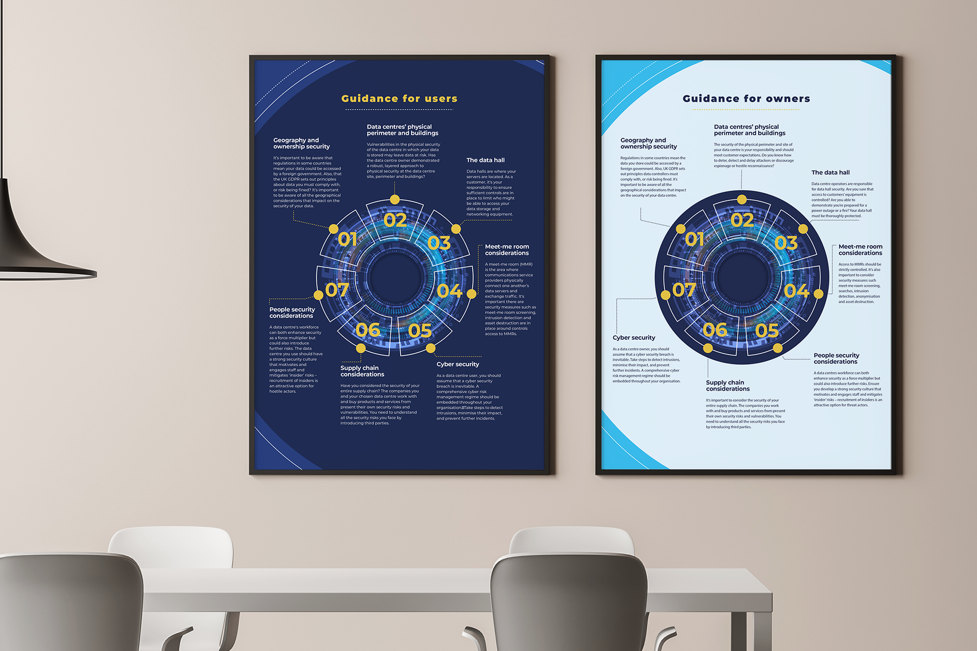
We gathered all the existing guidance together and gave it a thorough going over. Satisfied that we were comfortable with the ins and outs of data security, we recognised that some of the information had to be pivoted slightly for owners (who were more au fait with the language and concepts surrounding data) versus users (who weren’t necessarily experts).
Along with interpreting and tidying up existing guidance, we spoke with subject matter experts to make sure the information we had was up-to-date and accurate.
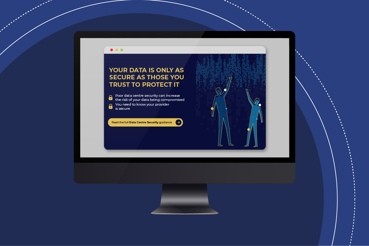
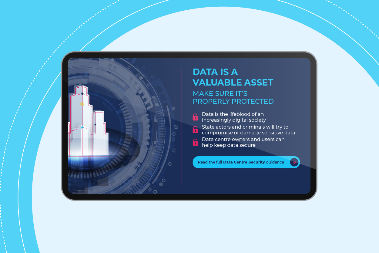
From there, we broke up the information into web pages, animations and handy downloadable assets – making sure this was accessible under one roof. When visiting the site, readers would be greeted by a moving combination lock-style graphic – highlighting the seven areas at risk from attack for owners and users. This meant that all the fundamental information they needed was neatly packaged together in the same (visually appealing) place.
Why it worked
The Behavioural Science
Fluency Effects
If it’s easy to read, it’s easy to do, pretty, good, and true. Or so say academics Song and Schwartz. Making things simpler and more readable makes them more memorable and believable. Think: ‘Hands, Face, Space.’ (Or, if you can bear to, ‘Live, Laugh, Love’.)
Our introductory security risk considerations were designed to be easy to read, understand, and act on. Jointly, we kept the essential but more heavy-duty guidance back for assets and brochures.
Chunking
How do you best digest huge, unwieldy wodges of information? By breaking them into bite-sized chunks, that’s how. ‘Chunking’ information pleases our short-term memories and helps them process and cope with that information so much better.
This project meant both unifying and dividing in order to conquer – putting all the material together in the core script but also splitting it into explainers and assets that wouldn’t be too intimidating for our audience.
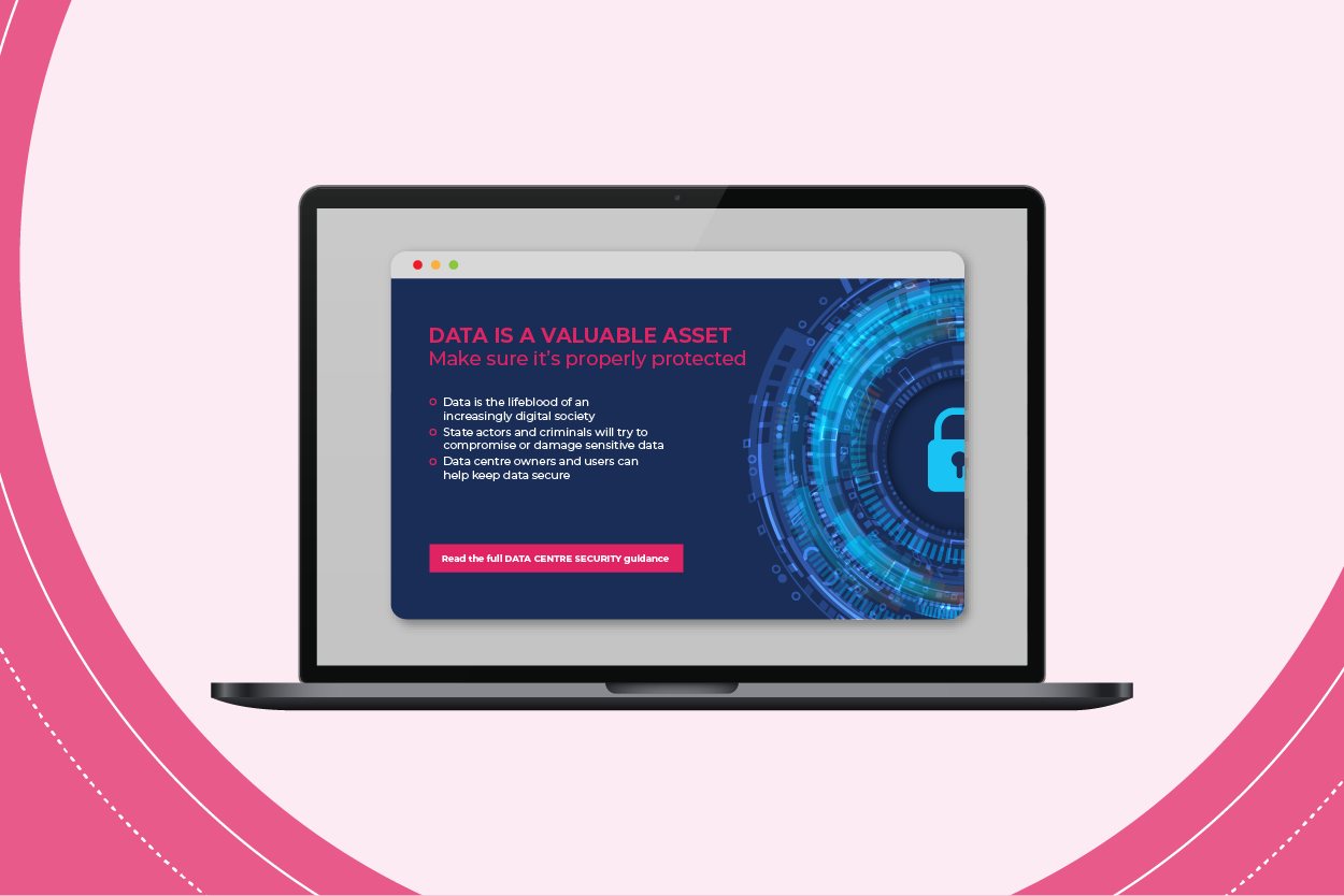
Picture Superiority
As behavioural communications devotees, we’re big believers in the power of words. But we also appreciate that a picture can speak a thousand of them. The lock graphic we created was an effective way of bringing information together in one place while showcasing that the guidance was connected, unified and secure.
The picture superiority effect only really works when images are related to the content. In this instance, the lock image was (ahem) key. We wouldn’t want to illustrate the serious business of data guidance with pictures of, say, multicoloured horses. (Although perhaps we would if we made them multicoloured Trojan horses – but, well, you get the picture.)
Why it worked
The Behavioural Science
Fluency Effects
If it’s easy to read, it’s easy to do, pretty, good, and true. Or so say academics Song and Schwartz. Making things simpler and more readable makes them more memorable and believable. Think: ‘Hands, Face, Space.’ (Or, if you can bear to, ‘Live, Laugh, Love’.)
Our introductory security risk considerations were designed to be easy to read, understand, and act on. Jointly, we kept the essential but more heavy-duty guidance back for assets and brochures.
Chunking
How do you best digest huge, unwieldy wodges of information? By breaking them into bite-sized chunks, that’s how. ‘Chunking’ information pleases our short-term memories and helps them process and cope with that information so much better.
This project meant both unifying and dividing in order to conquer – putting all the material together in the core script but also splitting it into explainers and assets that wouldn’t be too intimidating for our audience.
Picture Superiority
As behavioural communications devotees, we’re big believers in the power of words. But we also appreciate that a picture can speak a thousand of them. The lock graphic we created was an effective way of bringing information together in one place while showcasing that the guidance was connected, unified and secure.
The picture superiority effect only really works when images are related to the content. In this instance, the lock image was (ahem) key. We wouldn’t want to illustrate the serious business of data guidance with pictures of, say, multicoloured horses. (Although perhaps we would if we made them multicoloured Trojan horses – but, well, you get the picture.)
The results
At the time of writing the results aren’t in on this one. But what we can say is that the updated, smartened-up and singularly-housed guidance is currently live and helping protect both users and owners of data.
Want campaigns that really make a splash?
Worried your L&D programme is making ripples rather than waves? For behavioural-based comms or training, get in touch and we’ll spring into action.
(Don’t worry about filling out the form – we always protect your data.)
Get in touch