
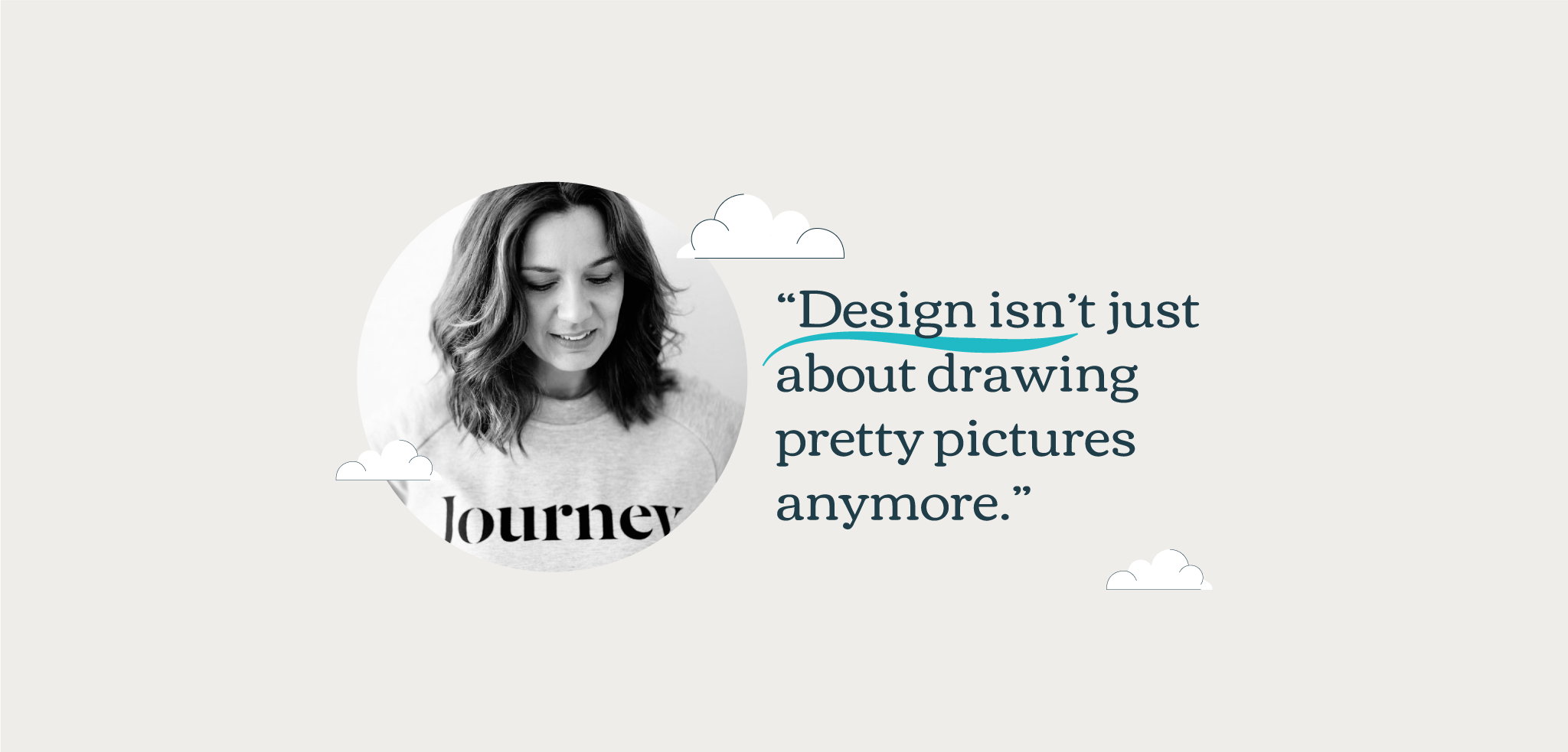
Design isn’t just about drawing pretty pictures anymore

In the late 1990s – in her favourite Doc Martens and an oversized jumper – Anna began her design journey. Her vision? To combine a thirst for learning with a determination to create a beautifully designed world.

Fast forward nearly three decades later, and she once again owns a pair of Doc Martens and an oversized jumper. Fashion aside, Anna shares with us what she has learned in over 25 years in the industry: from publishing and communications, to building e-learning products that engage and the importance of design inclusivity.

Anna – you’ve been on quite a journey. What’s the most important thing you’ve learned so far?

You know, I was given a dyslexic diagnosis quite late in life. That was a revelation: suddenly everything made sense. I realised why creativity was like breathing for me. You see, I could understand and translate the world visually but also I could express myself that way much better. Unfortunately, the way I was taught to learn in my early years wasn’t right for me and that created a lot of challenges.

Since my diagnosis, it’s become my purpose to design more inclusively. To think about the people who want to learn but might have different needs from others. Thankfully the last few years have seen a major shift for the need for inclusive design and accessibility from the big corporations. Seeing that makes me really happy.

So, are you always designing with accessibility in mind?

Yes, although it kind of comes naturally. If I design an e-learning course or product for one of our clients it has to make sense to me. I go through the User Experience (UX)  with my team over and over again to ensure all possible ‘problematic areas’ have been ironed out. This has been a very long career and I’ve seen it all. From designers who do not want to compromise their vision to make things work, to clients who need highly engaging products but have lots of internal restrictions.

Yet I enjoy that challenge. For me, design, function, and the client brief need to be choreographed in complete harmony.

What are your key practices for achieving this harmony when it comes to e-learning?

1

Understand the brief.

I have seen a lot of designers creating beautiful assets for clients that are utterly wrong! If you don’t understand the brief, how are you going to design for it? Invest time with your client at the briefing stage: ask the right questions and guide your clients through this process. Complaining about receiving a bad brief is not an option. If that happens it’s time for some self-reflection. What could you have done to help your client to give you the right answers? Maybe create a briefing form with all the questions that you need to have. Clients are busy people – you might need to have a call and take them through those questions rather than asking them to write it for you.
2

Start with the function

I always start an e-learning project working on wireframes. This is where you lay out all the functionalities your course needs. It’s a simple way for the clients to see the functionality and layout - but it also works as the point of reference for everyone involved in the project. Account managers can have a much better understanding of your vision. Writers can see where the need for content is. Designers and developers will have a clear understanding of what needs to be done and what technologies will need to be implemented.
3

Design with simplicity in mind

This might sound easy, but it’s the most difficult way of designing. Creative work can wow people when it’s explosive and ‘loud’ – trust me, I’ve done my fair share of loud designs. But the magic, especially for e-learning, is to create something really engaging that helps the learner digest the content in a simple form. The learner shouldn’t work hard to understand the design, it’s exactly the opposite that should happen. How to do this? Create space between the content and the visuals. Use clear typography to signpost anything important. Have clear calls to action for anything that needs attention.
4

Use gamification

I recently worked on a project that had an extremely lengthy, practical policy that all employees needed to learn. So, we developed an e-learning course for them that injected a bit of fun into the user experience. Elements of gamification - quizzes, drag and drop questions, ‘Where’s Wally’ style visuals and animations - all added up to create an engaging experience. Plus - collecting badges. I mean, who doesn't love a badge? But there’s a serious point here. Heading up the creative department of an agency specialising in behavioural communications means we’re always on the lookout for techniques from the brain and behavioural sciences. And we know gamification works wonders - it increases engagement and leads to better learning outcomes.
5

Consider accessibility

Always design with accessibility in mind. According to the Dyslexia Association, dyslexia is the most common disability encountered in the workplace. But when it comes to design, there are numerous conditions and impairments that we need to consider. Over 16 million people in the UK are classed as having a disability. So we need to design for all. Everyone needs to be included. Learning should be for everyone.

When it comes to design, what three words should readers take away from this?

Make design: simple, accessible and fun.

There is still a lot to discover and learn in this space. But the more people we serve, the more exciting this journey becomes for me.

Design isn’t about drawing pretty pictures these days – although I’m not sure it ever was –  it’s about so much more. It’s about helping people to navigate and learn complex topics, while avoiding information overload.

Want to know more about the science of e-learning design?

Download our guide on 10 techniques from the brain and behavioural sciences that are surefire ways of boosting your e-learning programme, without blowing your budget.